Stockholm | Our Highlights
In terms of events which inspire us – it doesn’t get much more exciting than Stockholm Furniture Fair. As a Studio we continuously look to Scandinavian design for ideas and this annual event brings together buyers, designers and architects from all over the world to view the latest collections from studios – the perfect location to fuel our creativity. A key theme which resonated with us from this year’s Fair, was the mindset of building items to last, designers are creating products with durability at the forefront. Outside of the Fair, this approach is echoed through the Swedes approach to life, recycling and sustainability is ingrained – we hope this mindset will spread.
During our two days in the Swedish capital, we tried our hardest to take in as much as possible, here are just some of our Stockholm highlights.
The Fair
With so many talented designers exhibiting their work, we wanted to share some of our studio edit with you.
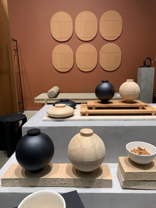
We’ve collaborated with the Danish designer Kristina Dam in the past but it was great to finally meet and see her beautiful collection in person. Apart from being incredibly tactile and innovative pieces, we also love how her studio defines their work as ‘simple and graphic’, with everything being made from natural materials with the intention of ‘timeless and enduring designs’.
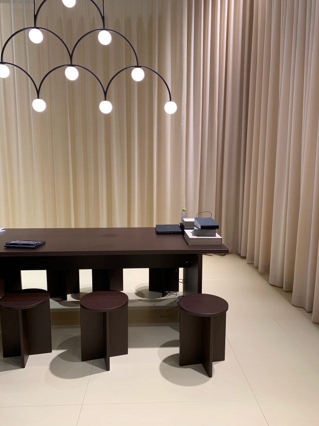
Lighting is something the Scandinavians are renowned for, and relatively young lighting brand Pholc (founded in 2015) are continuing the legacy. Pholc thoughtfully created a meeting space within their stand – inviting people to spend time within their space. It was a unique visual experience which beautifully mixed materials and textures. Providing a sanctuary from the rest of the fair and allowing for a moment of repose.
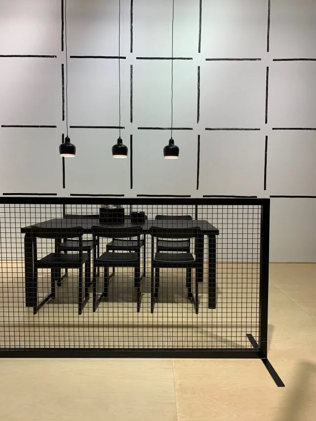
From a purely visual point of view, we loved the geometric design of Finnish designer Artek’s stand – its simplicity is what made it so captivating. With a clever use of lines and grids throughout, the graphic space created a fitting background to honour the brand’s aesthetic.
Friends & Founders have been a secret favourite of ours for a while now and we have featured the ‘Knockout’ table (seen below) in a few projects, so it’s always exciting to see the new pieces they’re bringing to the market. This time it was the Novel Lounge Chair, designed by Ida Linea Hildebrand, which we very much look forward to using on a future project.
The perfect marriage of classic and contemporary, &Tradition presents furniture and lighting inspired by traditional design to modern day – designed by some of the biggest names in the interior world. We appreciated their complimentary use of natural print with lux qualities velvet and marble (seen in the below picture of a table and sofa from above). This makes an interesting shift from the complete simplicity which we’re accustomed to with Scandi design.
Exhibitions
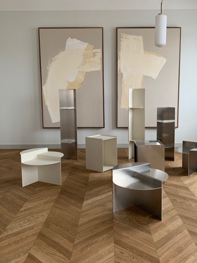
While in Stockholm, we visited our friends at Frama’s exhibition in collaboration with the architect Andreas Martin-Löf Arkitekter: Spatial Sensibilities.
The exhibition was a presentation of Frama Studio’s latest collection within Andreas’ newly renovated space. The space itself is one which creates a complete sense of calm, through its simplistic elegance – herringbone wooden floors, muted tones and natural light are the perfect combination. Frama’s collection sat like works of art within the space.
Our Base
Returning home each evening to our hotel: Ett Hem (At Home) made the long days that bit easier. Named as Stockholm’s ‘chicest hotel’, the 1910 Arts & Crafts house was renovated in 2012, with interiors by Ilse Crawford. It might be new but the space communicates luxury through its carefully curated design.
Shops
Last on our list are shops. Stockholm has an amazing vintage scene, both for furniture and fashion, which unfortunately we didn’t get the chance to fully explore. However, there was one shop in particular which caught our eye: Dusty Deco, a furniture shop which combines design classics with vintage objets – the only rule being that the owners would love to have the item in their own home! In particular, we loved this fiberglass table by Aschberg & Magnuson.


