Milan Design Week 2019 | A Review
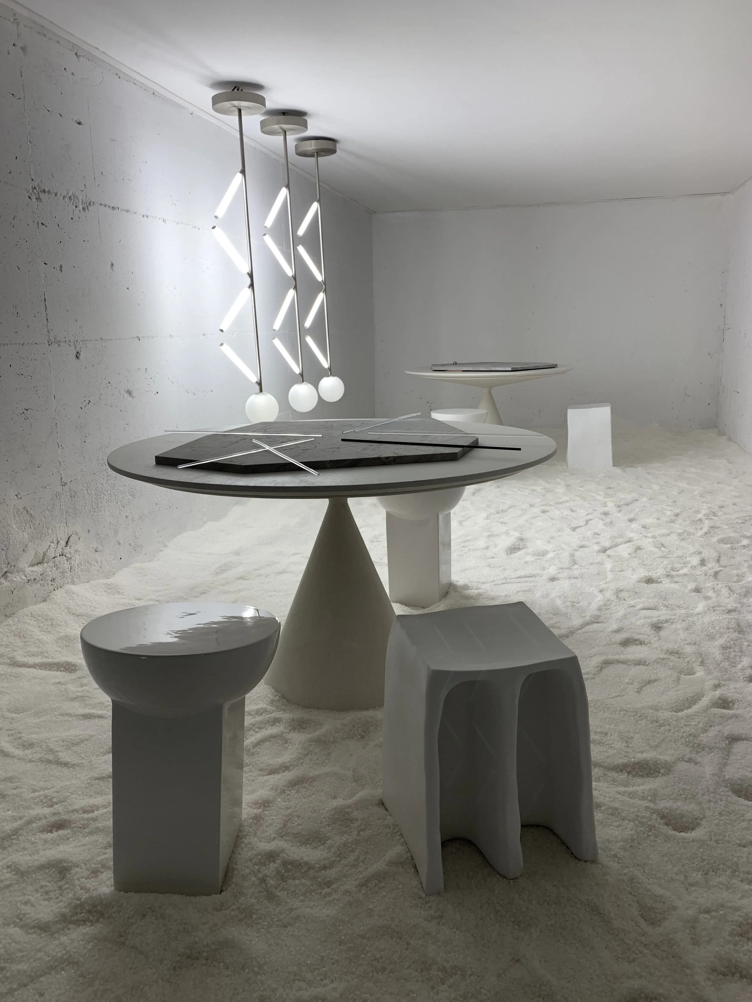
Hidden Rooms by Salvatori
Salone del Mobile 2019 was for us, three intense, inspiring and innovative design filled days. We ran between installations, shows and open houses to make sure we got the most out of our time there, while making sure to stop, take respite and catch up with our industry colleagues and friends over a coffee or Spritz.
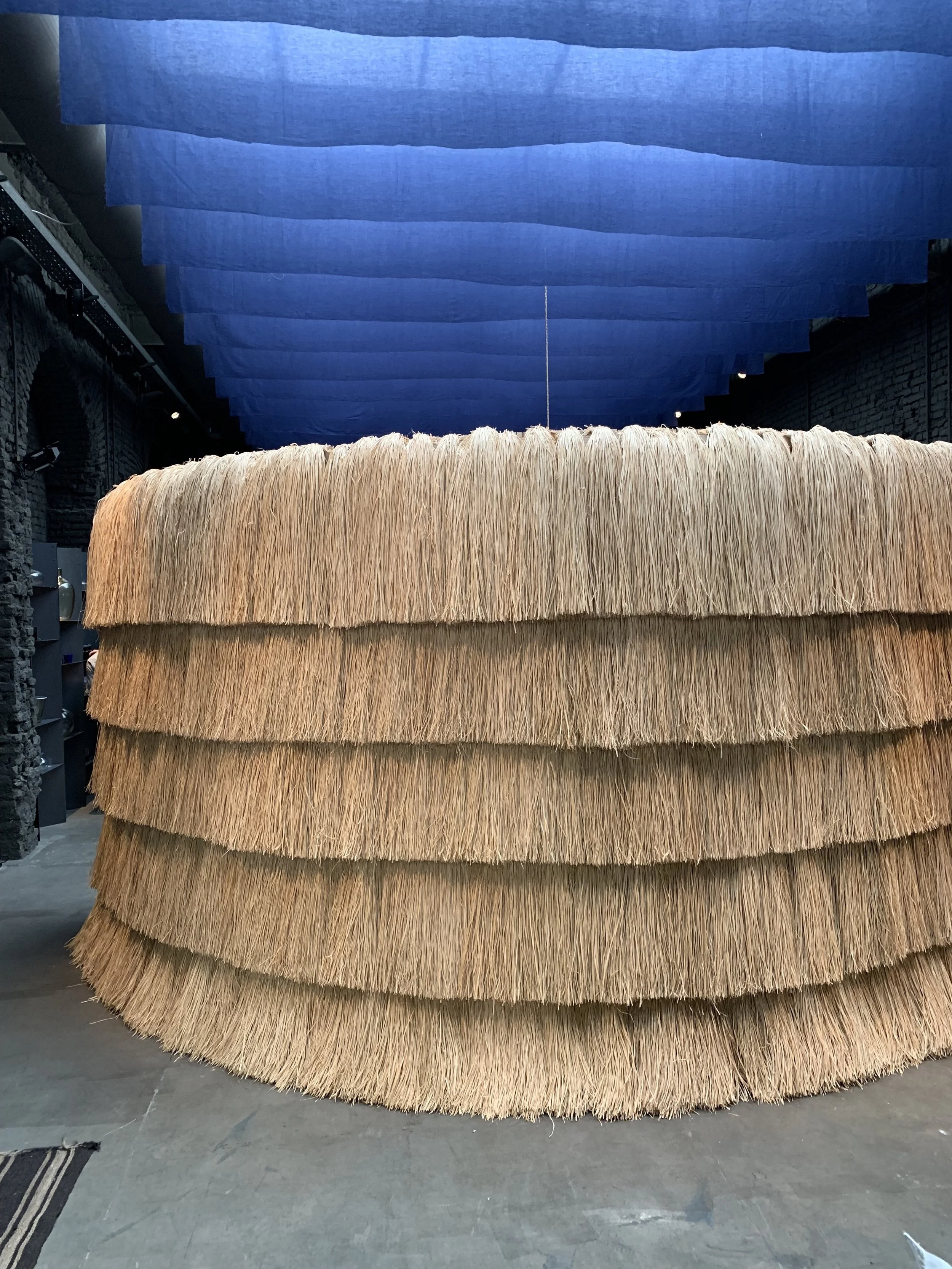
In Milan a few trends really stood out, we saw that bamboo and wicker are the materials of the moment, in various forms, formats and guises - from woven bags to seat pads it seemed to be everywhere we went. At a complete juxtaposition with this was the use of corrugated metal which was often powder coated and had been used in numerous concepts across the event. We also noticed the use of durable resin, which was used both as a material and also to suspend items.
Six Gallery
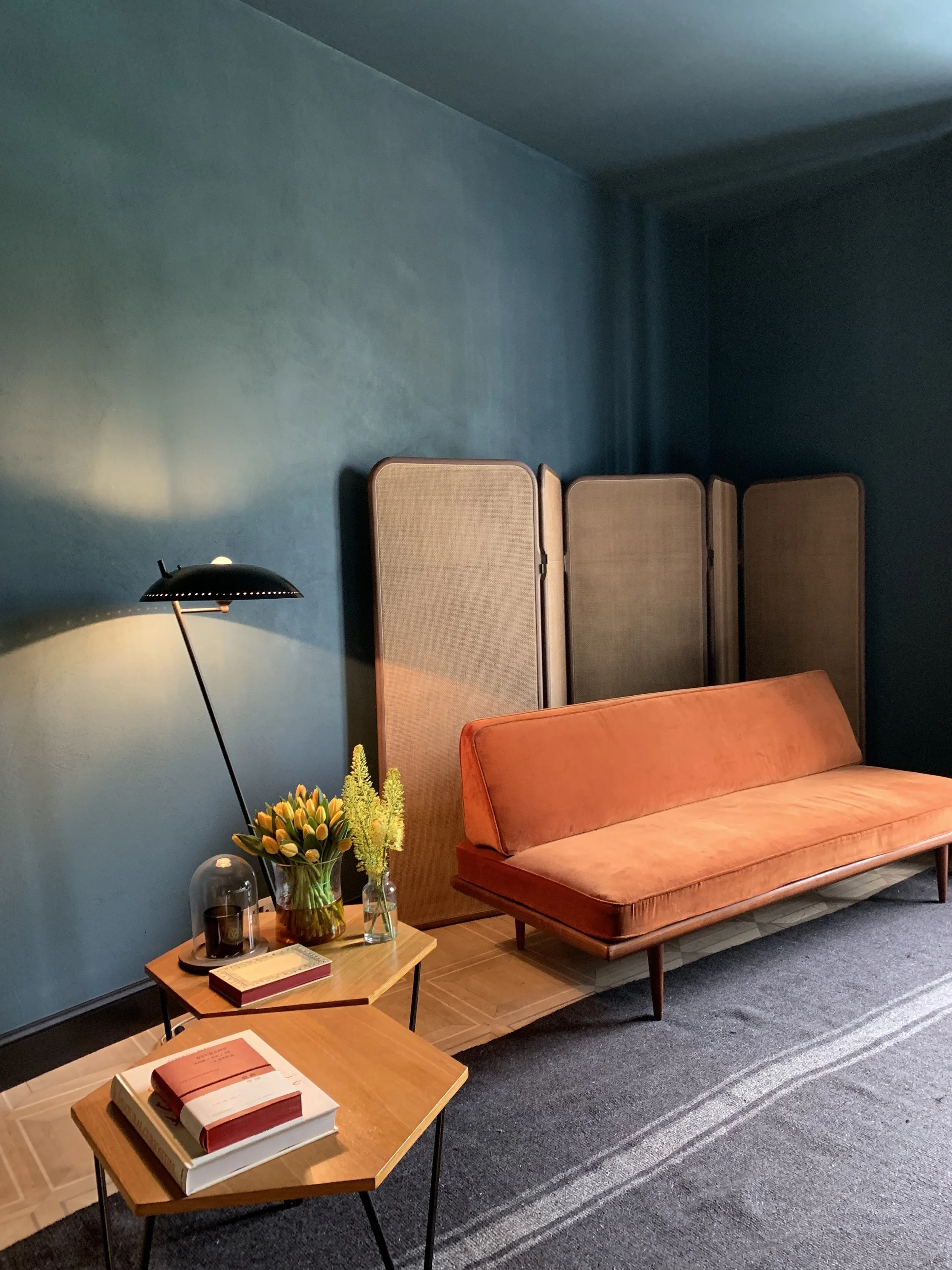
Six Gallery, by David Lopez Quincoces and Fanny Bauer Grung, is first on our list of stand out installations from this year’s event. Guests got to preview the duo’s new hotel which is opening this September and showcased their impeccable taste through the combo of deep matt pigments on the wall alongside beautiful collected pieces which had been carefully selected. Our favourite were the oversized Japanese fans which were made in to wonderful wall sconces - their show gave a nod to Eastern style whilst never losing sight of the brands modern innovative edge.
Sister Hotel by David Lopez Quincoces and Fanny Bauer Grung
The Future is Unwritten by Milanese design agency Studiopepe also resonated with us. The show was used to launch the company’s new furniture range but also demonstrated the industry’s overriding movement towards creating an all-encompassing experience for the senses. Upon arrival we were greeted with a ginger infused tea and crystallised mint to accompany us through the show, brave colour palettes visually arrested us and a performance artist used movement to flow through the spaces.
The Future is Un | Written by Studiopepe
We relish getting the chance to see behind the doors of creatives homes and Salvatori’s CEO, Gabriele Salvatori, was no different. Opening his apartment daily between 3-6pm for visitors, we were thrilled to manage to fit in a visit. The home is noted for its interiors by Elisa Ossino studio, the pair regularly collaborate together and have even created a ‘perfect’ handwriting - we await to see what they do next.
The Home of Gabriel Salvatori designed by Elisa Ossino Studio
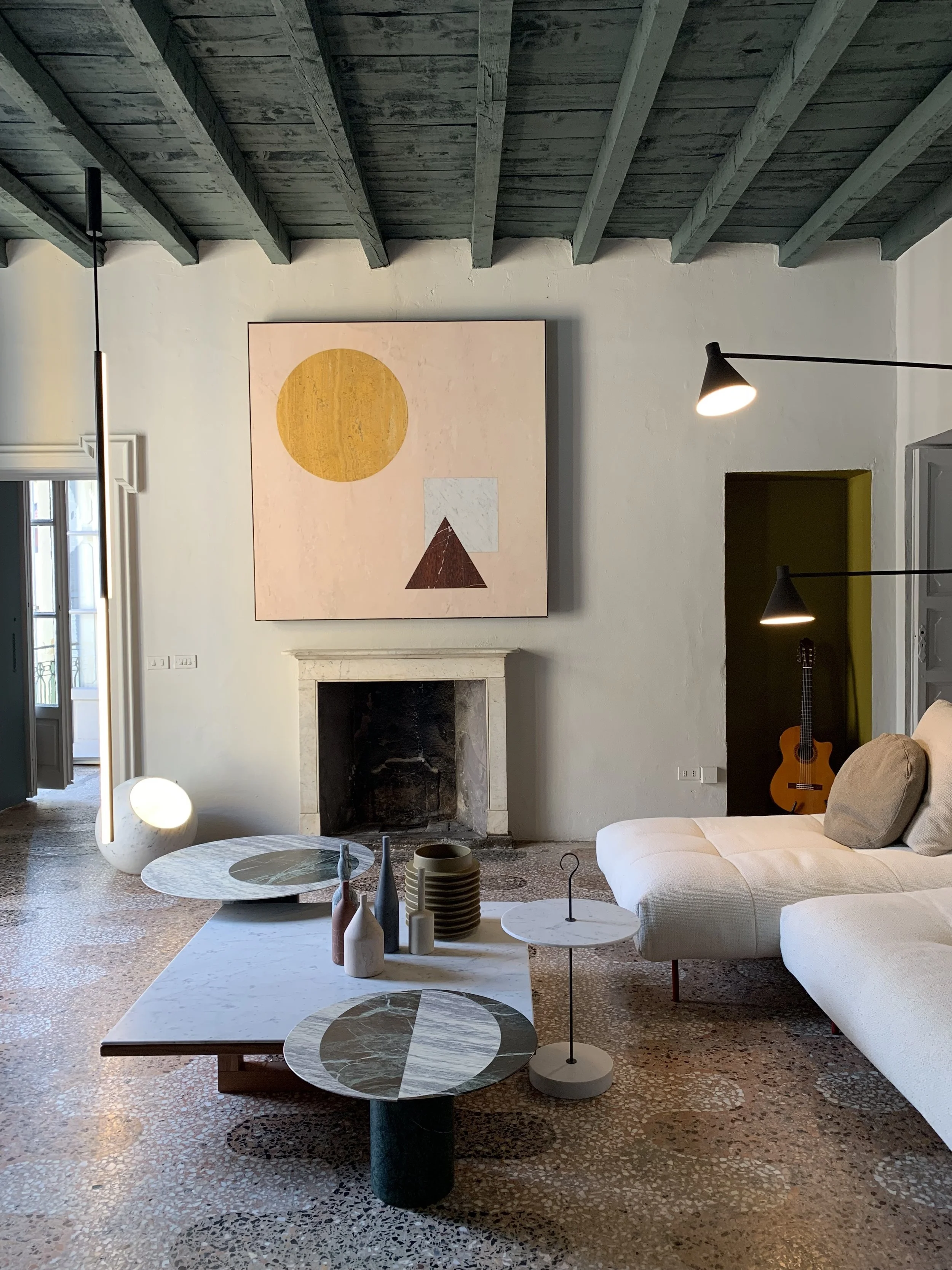
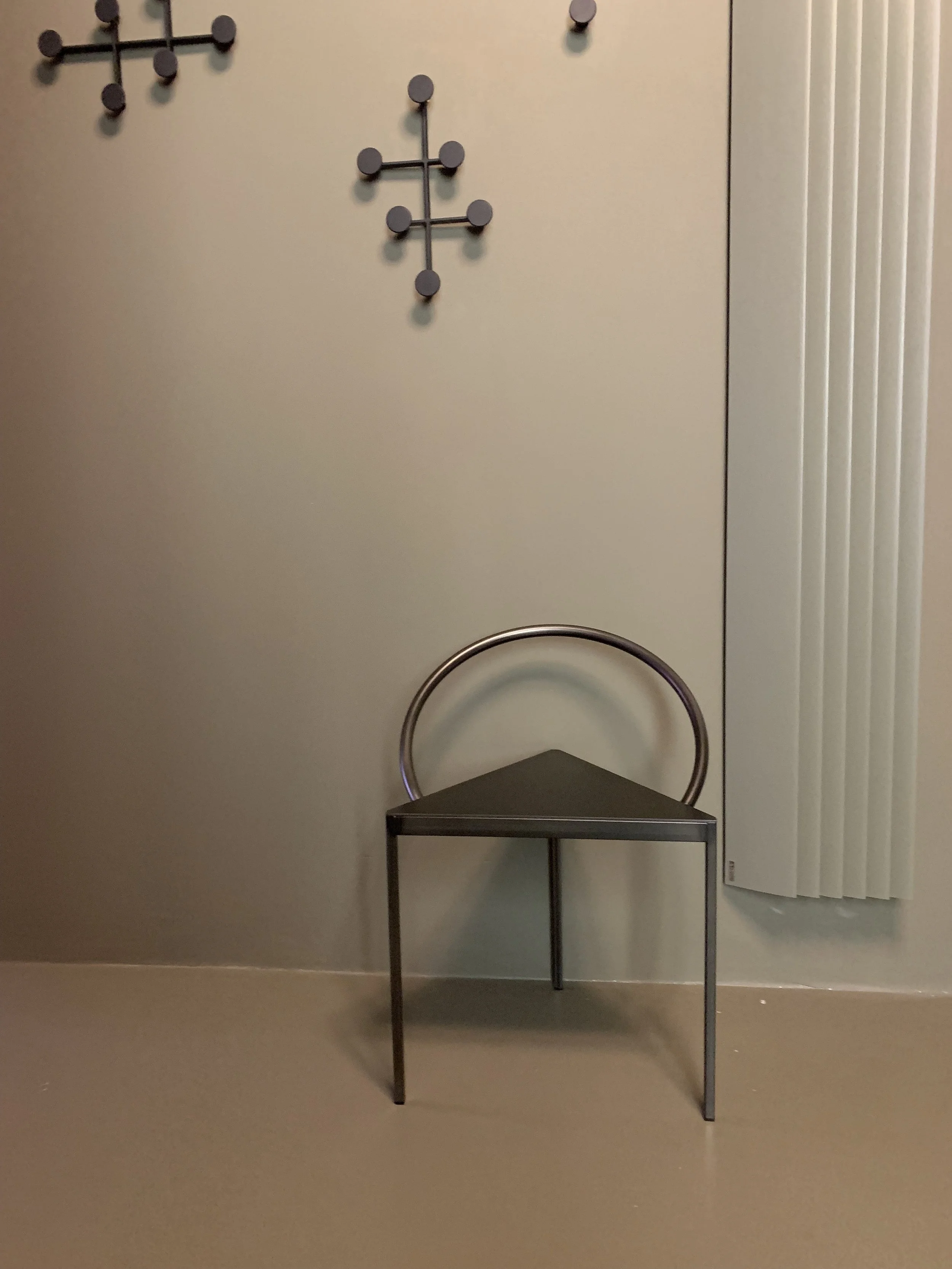
Harmonising Mediterranean and Scandinavian style as one, once again Elisa Ossino Studio, collaborated with File Under Pop, for Perfect Darkness. A show housed within a third-floor 18th century apartment on Milan’s Via Solferino, in the centre of the Brera design district. The apartment has been transformed by the duo to create a completely unique and beautiful location for displaying products by themselves and their 11 design partners, including House of Grey's partner, Frama. The use of colour and tiles within the ‘home’ environment was very well-considered and meant they were communicated in a completely different way when viewed alongside other shows. It will be running for the next 10 months and we highly recommend a visit.
Perfect Darkness by Elisa Ossino Studio & File Under pop, featuring the Triangolo Chair by Frama
It seems that this year was the year of collaborations, Kvadrat’s exhibition in collaboration with Raf Simons is another must-see on our list. Located at Garage Ventuno, the pair presented four new textiles in their exhibition, accompanied by amazing food by London restaurant Rochelle Canteen and incredible mid-century furniture. They pair also used furniture from Raf’s personal collection which was upholstered in his new fabric designs, these were displayed in Jean Prouve kit houses, whose aesthetic of functionality and fabrication were the perfect match for the show.
Raf Simons X Kvadrat with Rochelle Canteen.
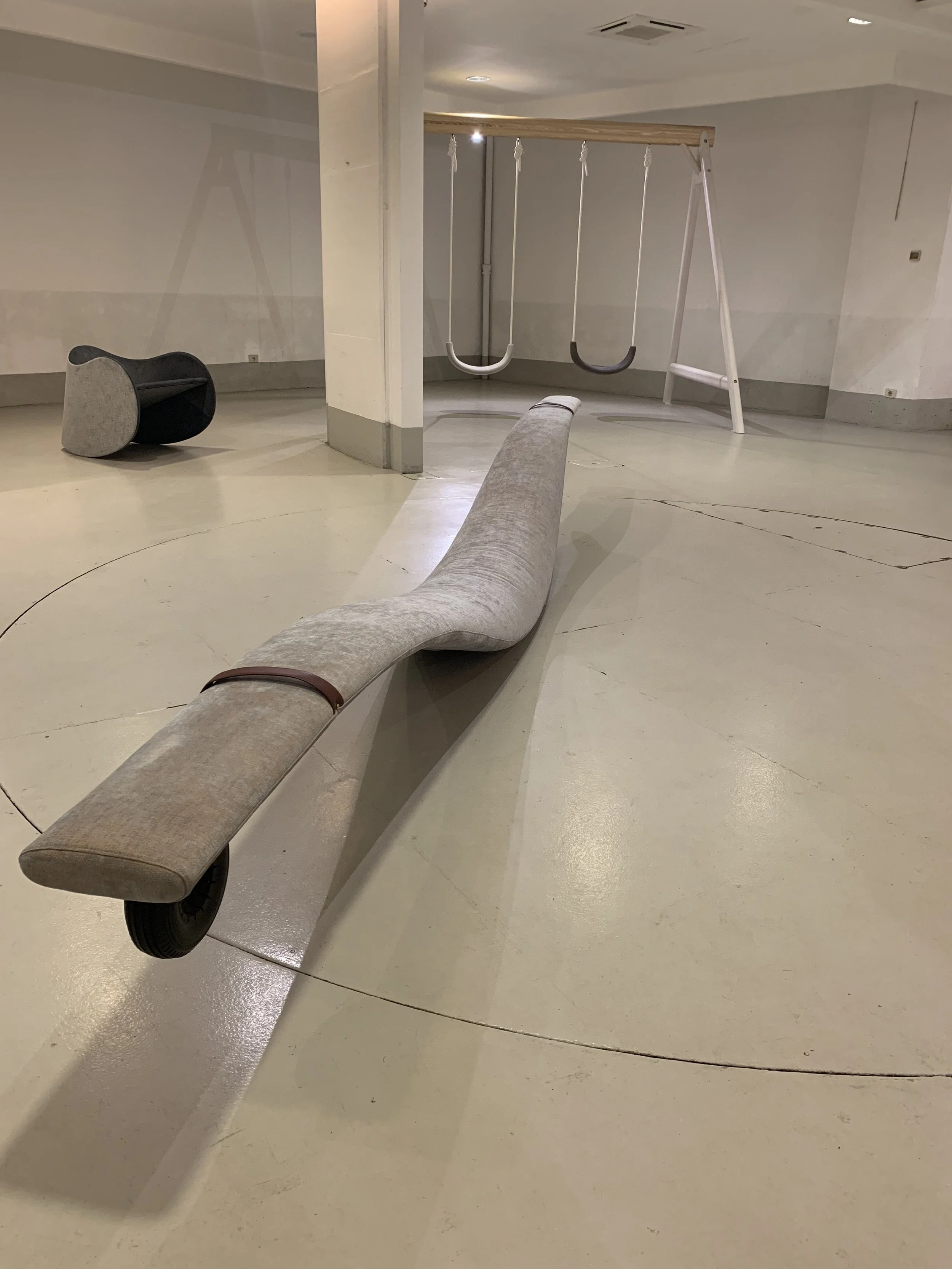
Lastly was a welcome bit of light relief in the shape of Playscape. An underground disused space which was created with the intention of letting visitors enjoy themselves, play and relax -something one rarely does as an adult. The comfortable yet considered design, resonated with us and allowed us to do something which seems impossible during the craziness of Salone - completely stop for a few minutes. It was so freeing to detach from the enormity of life and connect with our inner child.
Playscape by Mikiya Kobayashi x Karinoku


